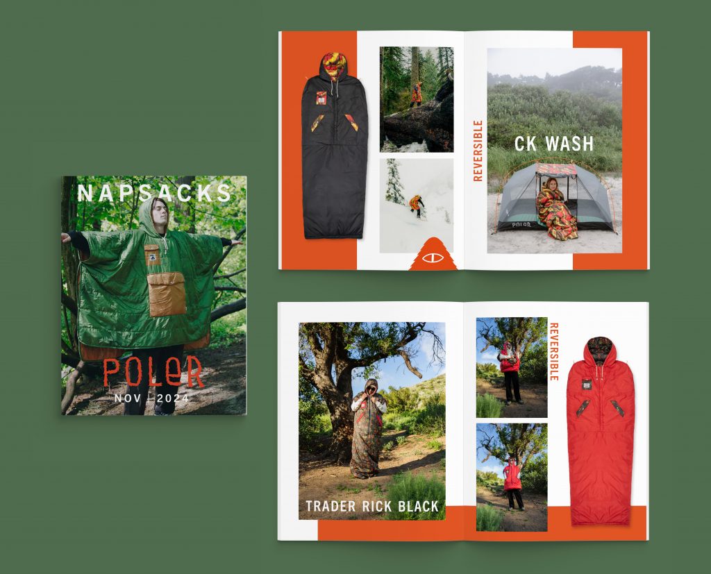
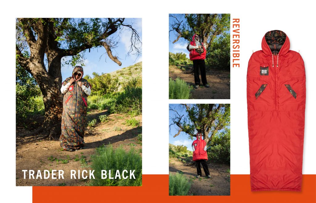
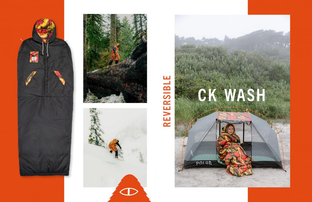
For this project, I created a look book for the brand Poler. The goal was to capture the brand aesthetic and brand voice, and translate that onto a physical printed medium. Poler is known for their napsacks, a fun camping invention that is totally unique to the Poler brand. So what better way to portray that brand by bringing the napsack to the forefront and putting a spotlight on this innovative product. The images on each spread were chosen specifically, as to further display the functionality of Poler napsacks in an outdoor environment.
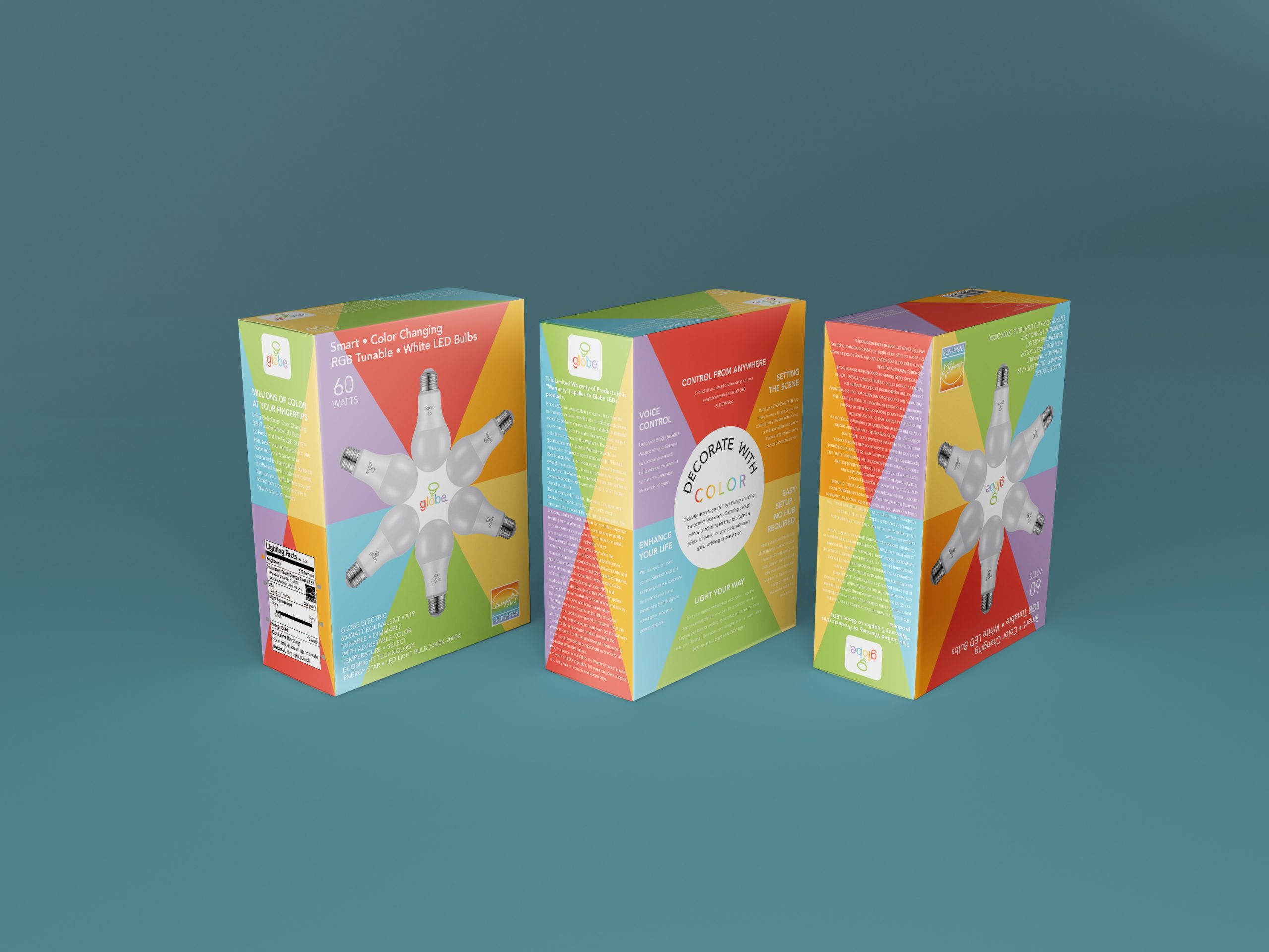
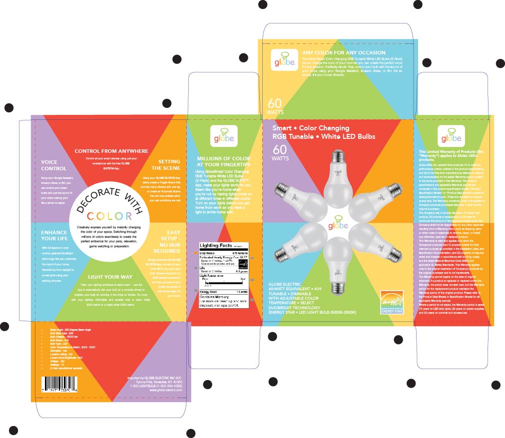
In a world full of lightbulb brands that all try to differentiate themselves from one another, this project aimed to reposition the Globe brand in a fresh and unique way. The idea behind this concept was truly rooted in this idea of decorating your space, and making your space your own with the use of color. With seemingly endless choices of color you can use to lighten up your living space, I really wanted to capture that in the packaging design you see here.
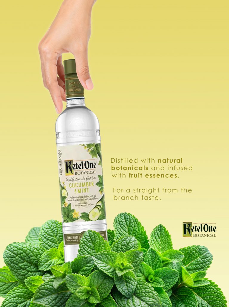
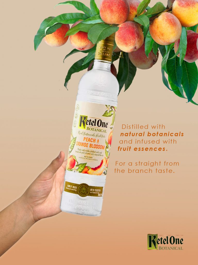
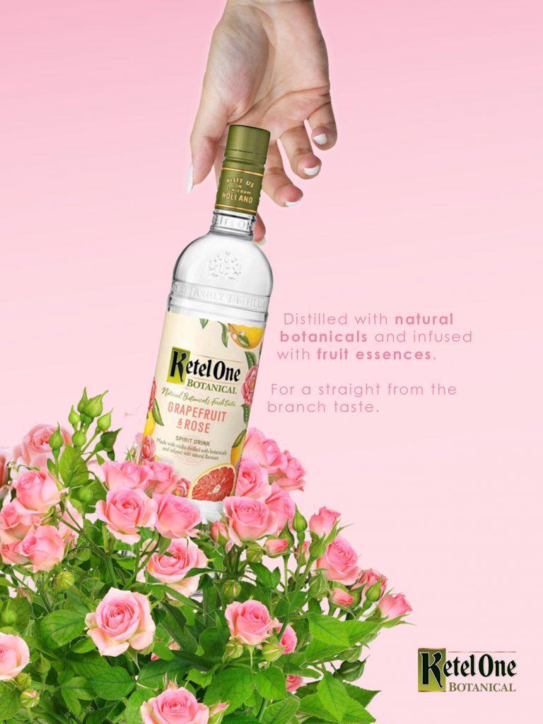
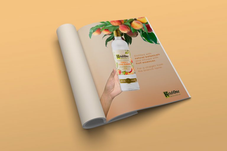
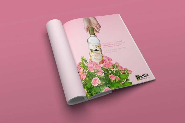
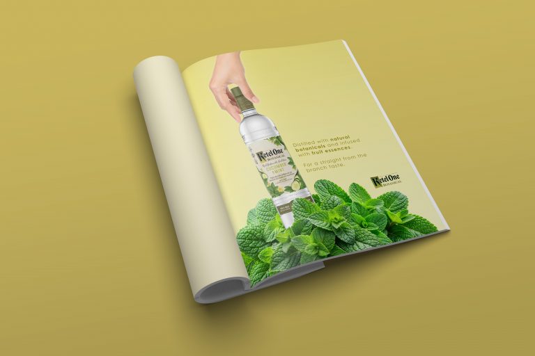
The Ketel One brand has positioned itself as a higher end brand of vodka that has truly expanded their selection of different flavors and types of spirits. With this project, I really wanted to create the feel of a spirit that truly is better than the rest. Ketel One’s botanicals are going to give the consumer that “straight from the branch” flavor that really puts the Ketel One brand above it’s competitors.
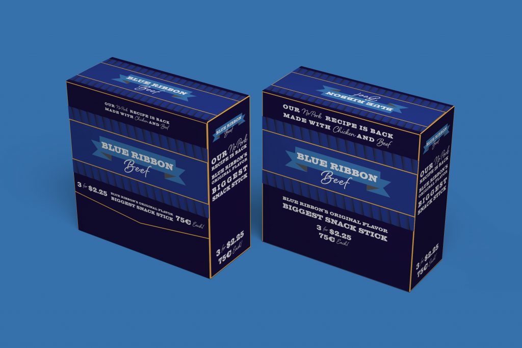
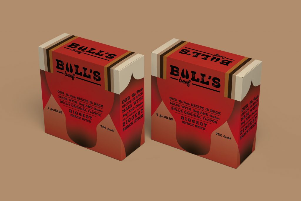
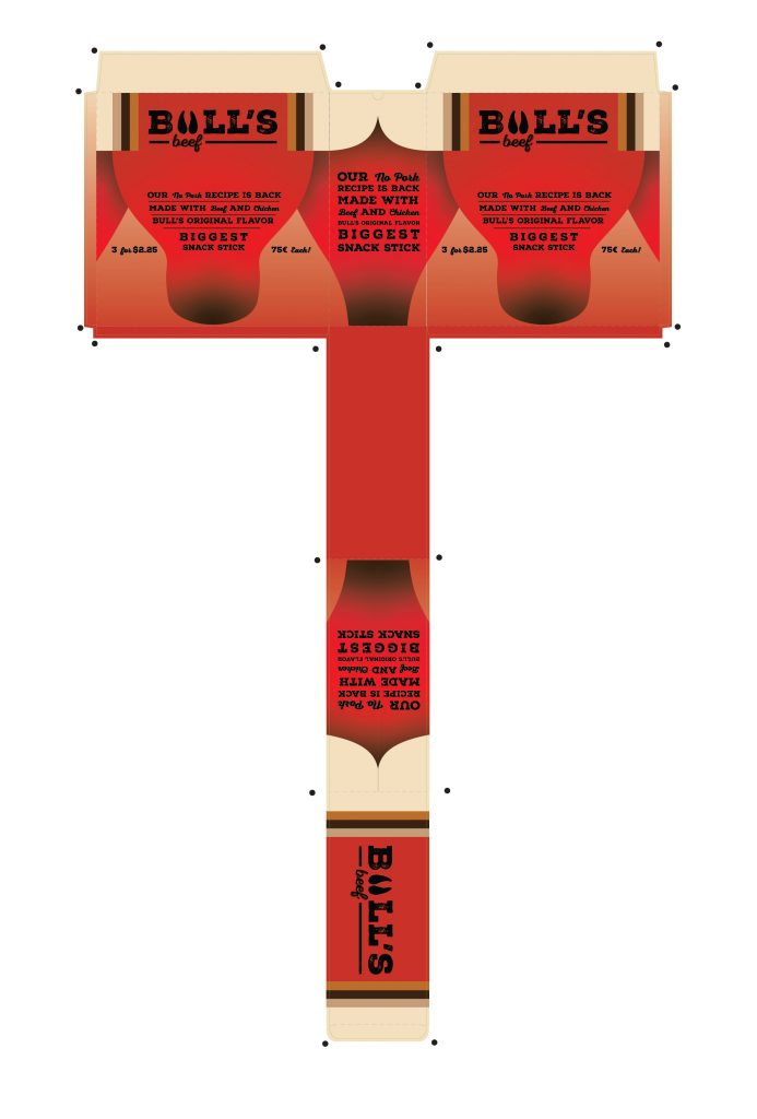
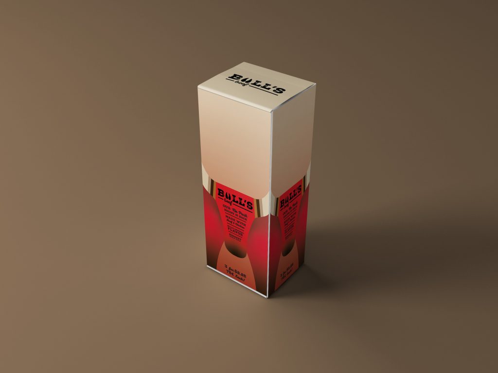
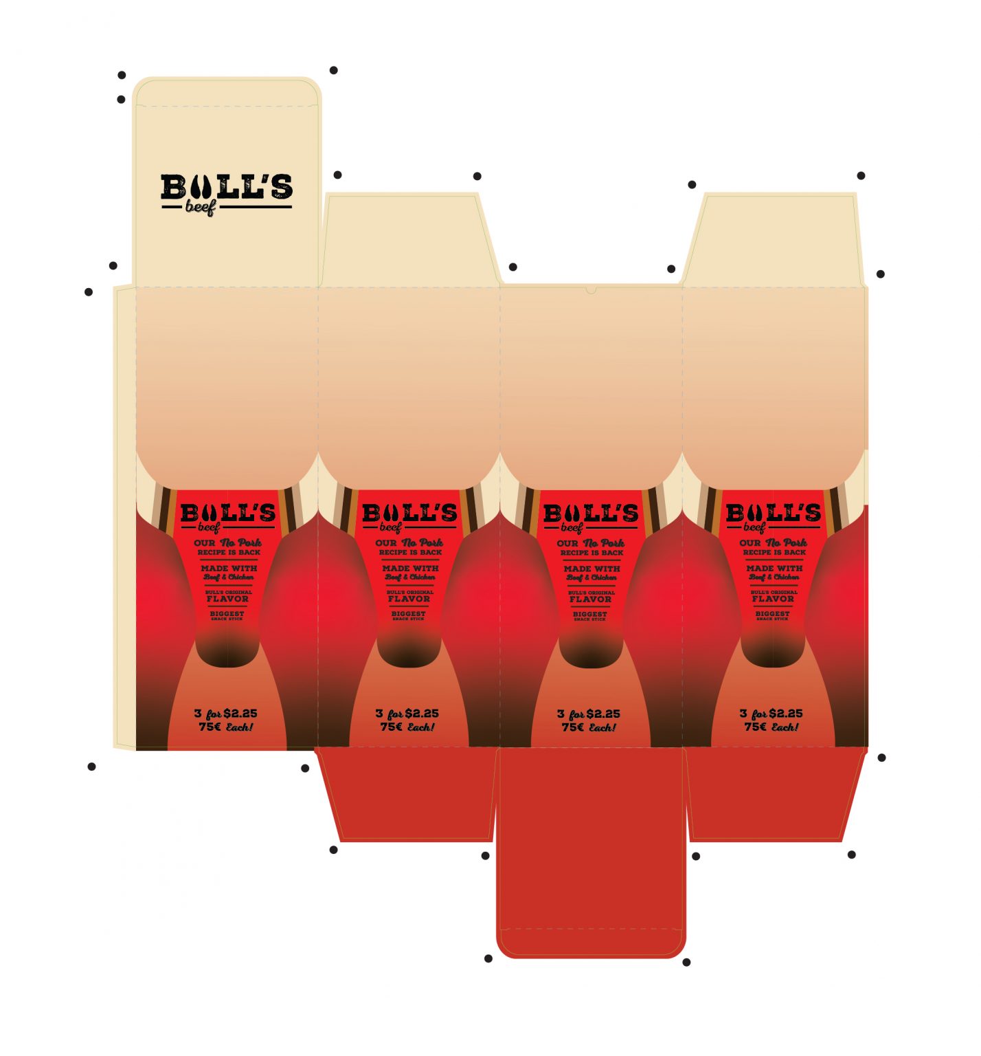
The Bull’s Beef brand is a brand that at first glance, isn’t really solidly establishing itself in the beef jerky market. This project intended to fix that. I created two designs, a total rebrand and a brand overhaul.
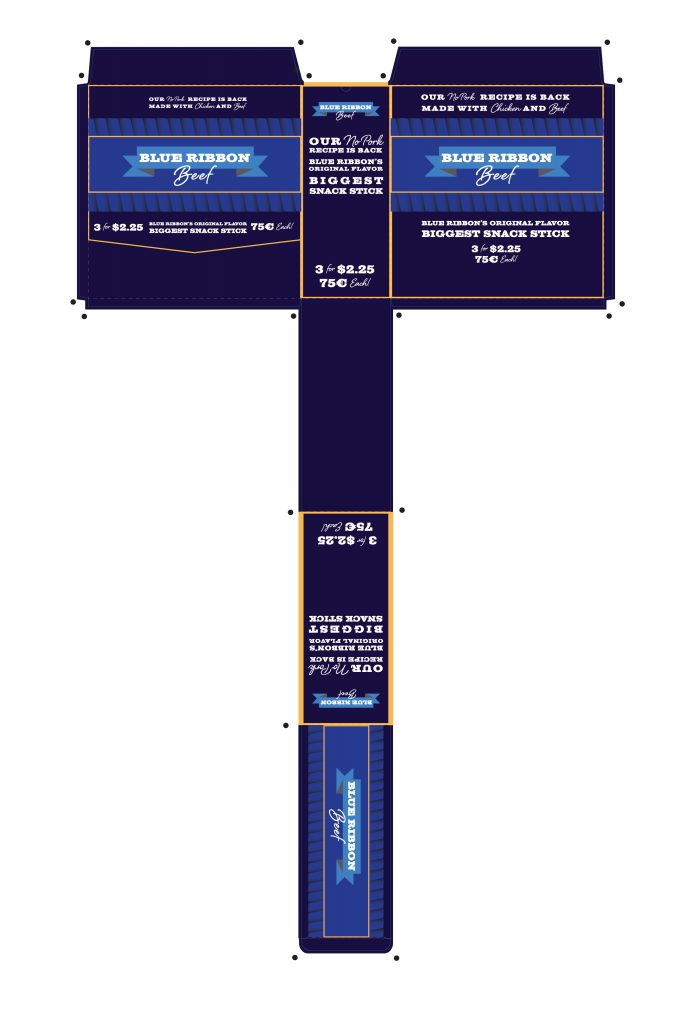
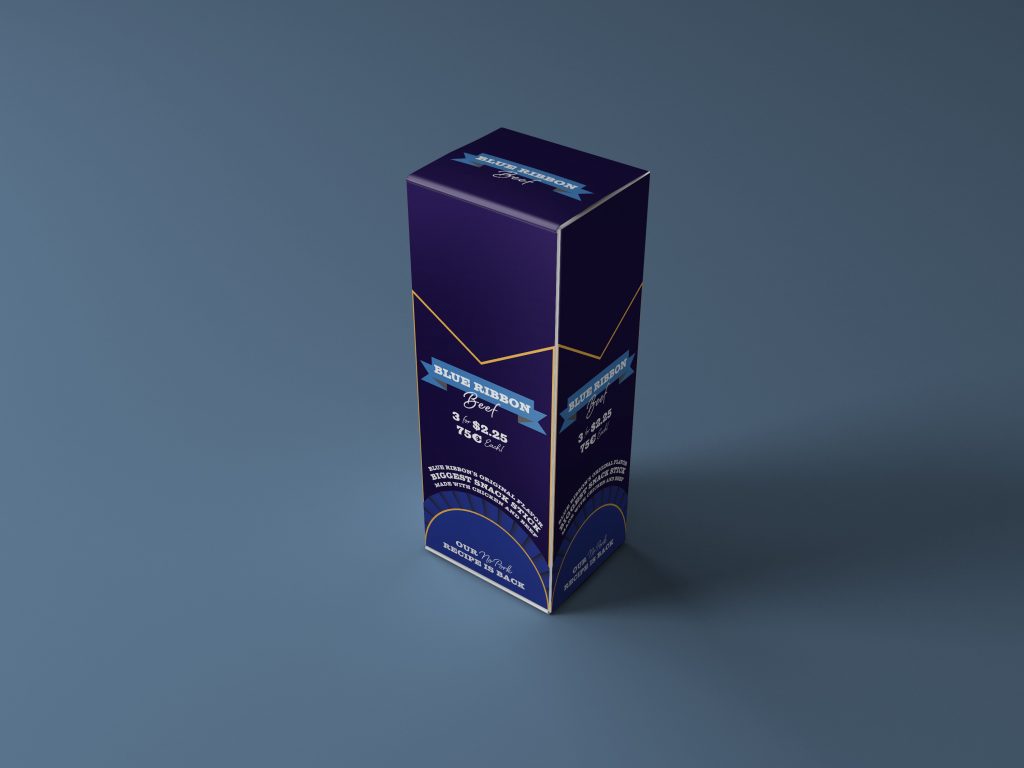
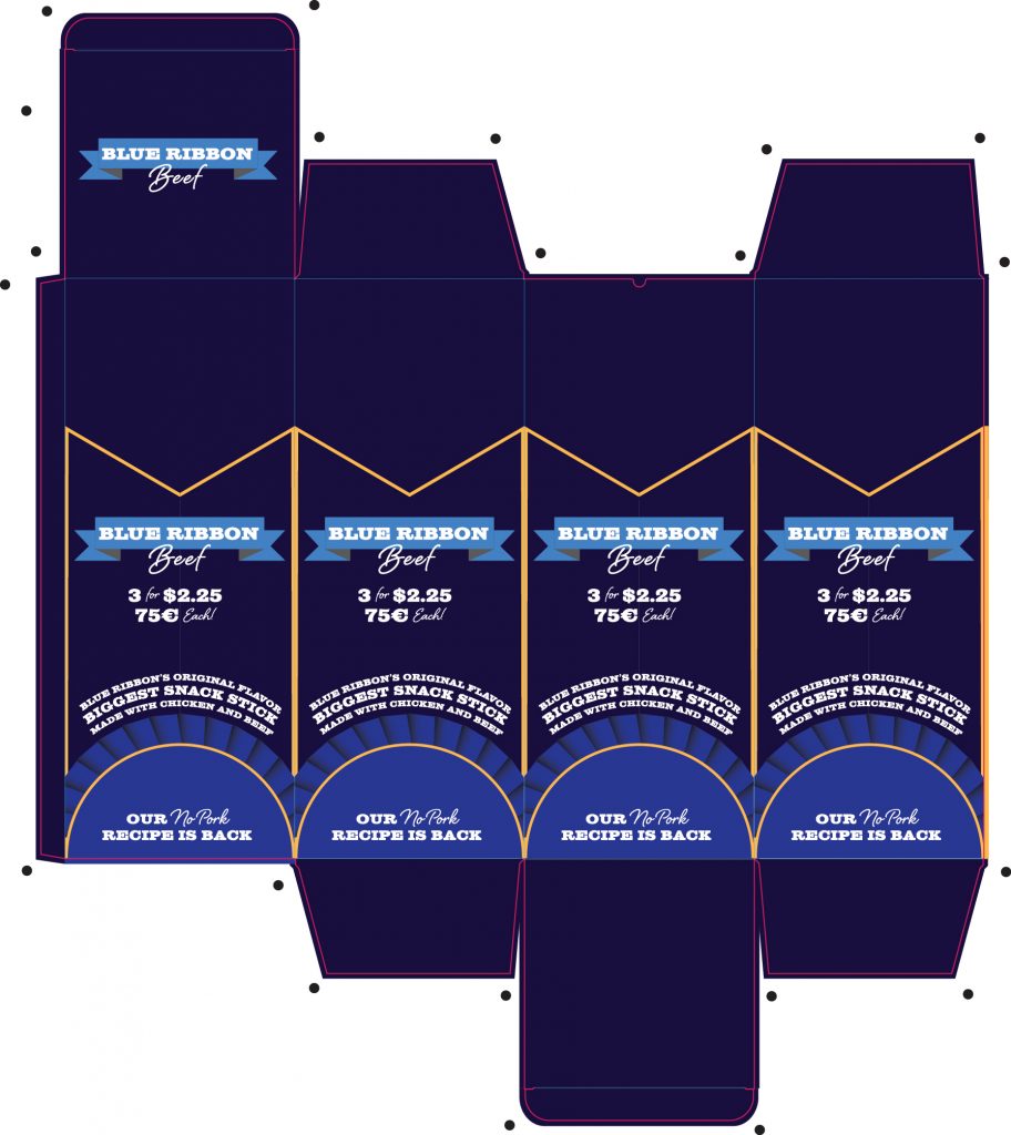
The total rebrand, Blue Ribbon Beef, positions the brand in a new updated and premium way. This concept was founded on the idea that the Blue Ribbon Beef jerky snack sticks are created from high quality, top of the line beef. I really wanted to capture that award winning feeling in the rebrand design.
The second design takes the original brand, Bull’s Beef, and gives it a completely new look. I wanted to still maintain and portray the feeling of intensity that prepares the consumer for strong beef jerky flavor, but give it a more refined and minimalistic look. Additionally, the color choices further add to the overall brand feel, giving it a southwest ranch feel.
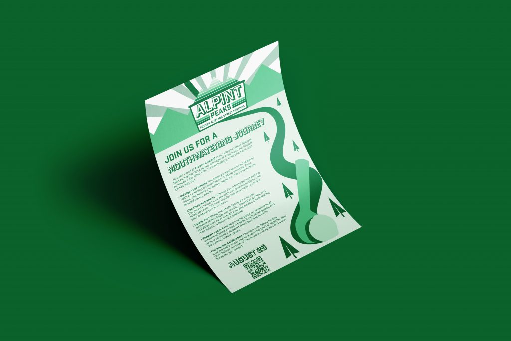
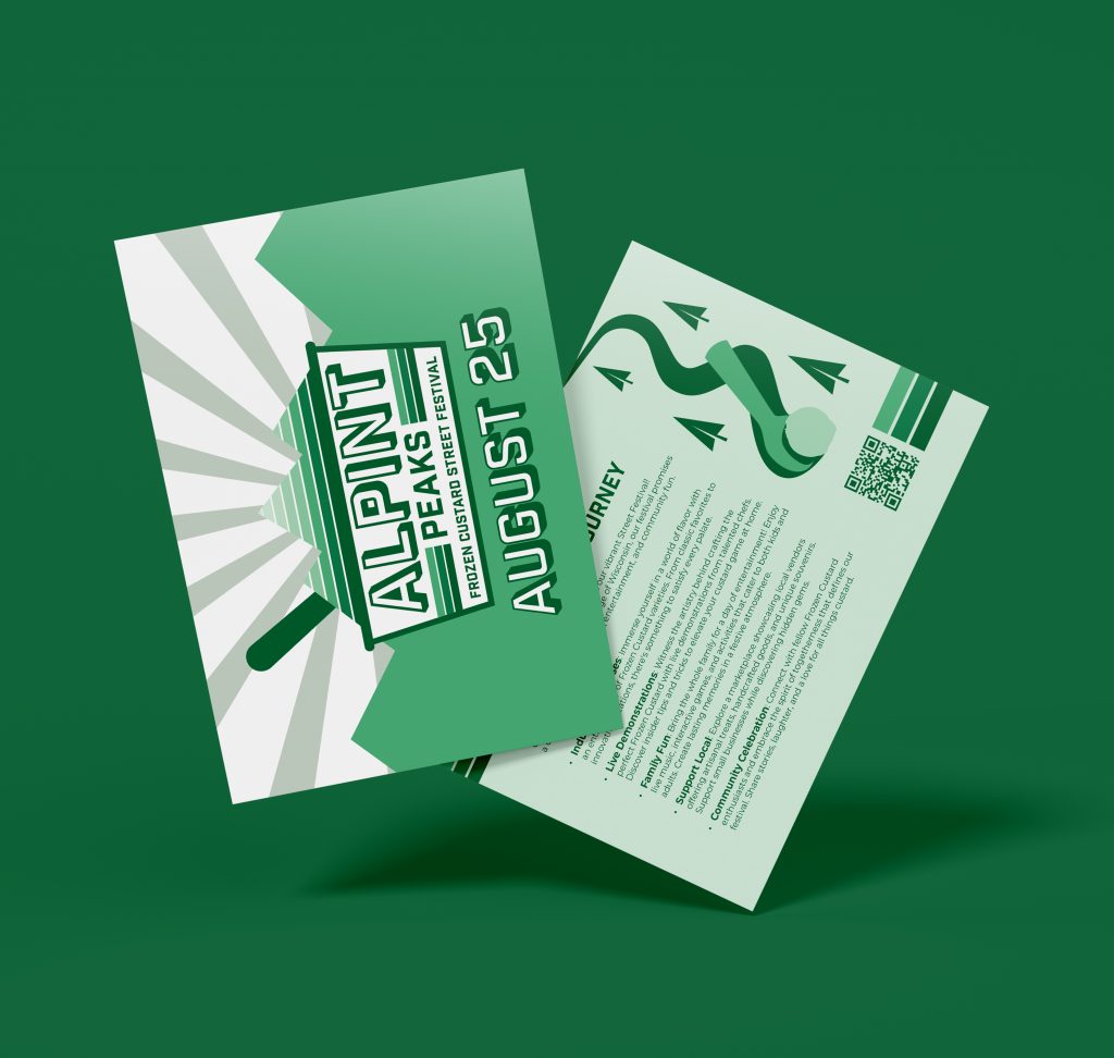
Frozen custard is a cultural staple to Milwaukee culture. For this project, I was tasked with creating a brand for a brand new, fictional frozen custard street festival. Set to take place in the heart of downtown, I researched the origins and history of frozen custard, which helped lead me to my concept.
The name for the festival would be Alpint Peaks Frozen Custard Street Festival. For the concept aesthetic, I wanted to create a retro feel with “alpine” and green forest inspiration. This retro aesthetic gives the viewer a feeling of nostalgia, taking you back to a time where frozen custard was really integrating itself into Milwaukee culture.
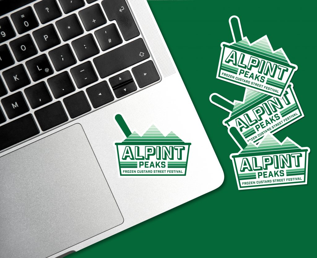
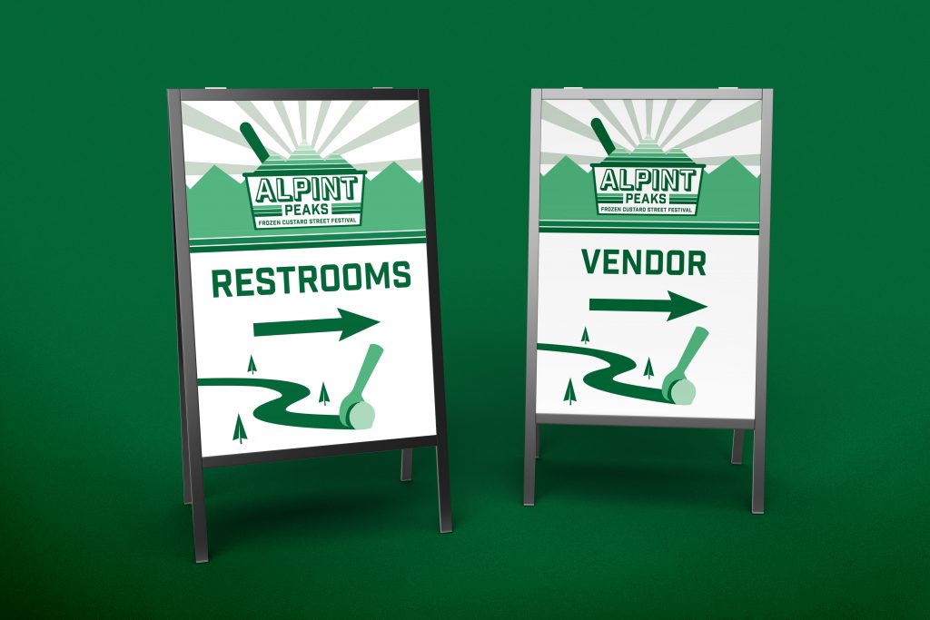
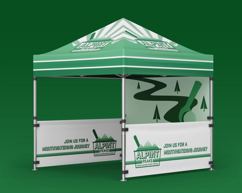
The branding is kept cohesive across the many different mediums utilized in the overall project. I’ve incorporated poster, flyer, sticker, sandwich board and a street tent mediums in this campaign.